Timeline charts
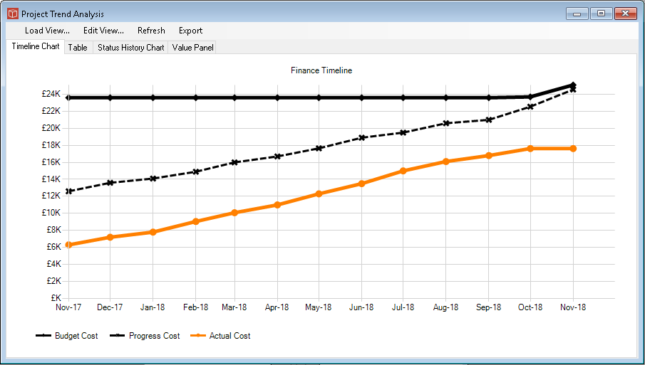
The Timeline chart is one of the Trend Analysis types available in PIAB. To configure it you will need to use the generic tabs which form the Trend view management and then focus on this specific tab here called Timeline Chart which we look at below. Firstly this is what our output might look like. This is using three properties and the 13 month period discussed in the View page.
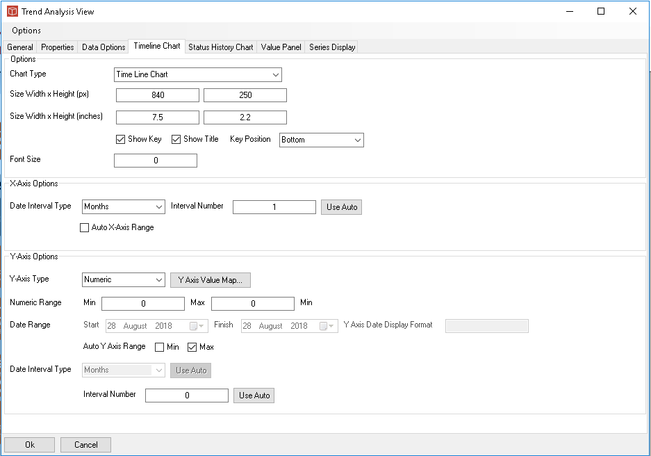
Firstly the Chart type picklist which enables you to choose a line or a bar format. You then choose the size at which the image should be created in px and then a scaling into inches which is used when the image is sent to a word report (note using 0 gives a default scaling). You cna then optionally show Key (and a choice of location) and optional title. You can alco force the font size. Again 0 uses default. Managing the Axis is important to get a good looking chart. X axis can be set totally Auto using the tick box or you can set the date interval type and either force the interval gap or auto it. This works well if the X axis is set in a similar arrangement to the time binning.
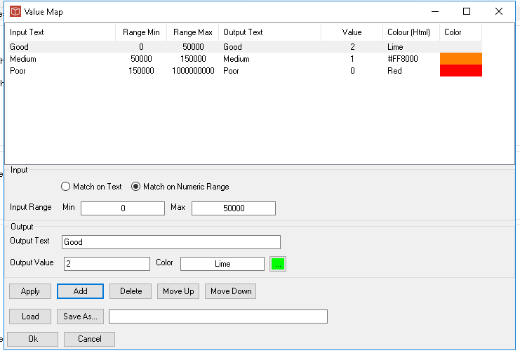
The Y axis is more complex as its controls depend on the type of data being plotted. With a type of Date the date range can be selected and a different format selected for its display. Also an interval type. With a Numeric, Currency or Percentage type you can independently set the min and max as abolsutes or Auto. In this case a min of 0 and a max of Auto. With a type of Value Map selected use the Value map button to open the value map form to set that up. Value maps can be used to bin numeric type data or to match on text (status type data fields). Using this you can set up a number of categories and plot status changes over time.
All types share the final selection which is interval 0 is auto or set the number you want. |