Status History Charts
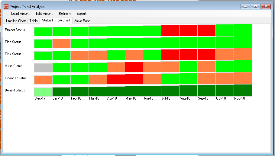
The Status History chart is one of the Trend Analysis types available in PIAB. To configure it you will need to use the generic tabs which form the Trend view management and then focus on this specific tab here called Status History Chart which we look at below. Firstly this is what our output might look like.
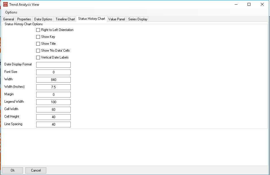
As you can see the format of this chart is very different. It produces a tapering set of coloured blocks, the largest being the most recent and the smallest being the oldest. The colour represents the status in that period. This allows you to see how statuses have changed over the selected time period. In this chart there are 12 months and 6 statuses selected. Firstly setting the options you can choose to alter the direction of time, show key (always at bottom) and title. No data cells can be shown in outline or left completely blank. Date labels can be turned vertical or left horizontal. The controls below then allow you to structure the size of the chart you want. Legend width is the title width left for the property name. Cell width is each (monthly in this case) cell. So we would need 60x12=720 plus 100 ie 820px to fit the data in hence ther image width is set at 820px to allow a margin. As usaul an Inches scale size allows you to force a size for use in word reports. You can set the cell height also but the overall image height is determined for you by the system (depending on the number of properties being displayed etc).
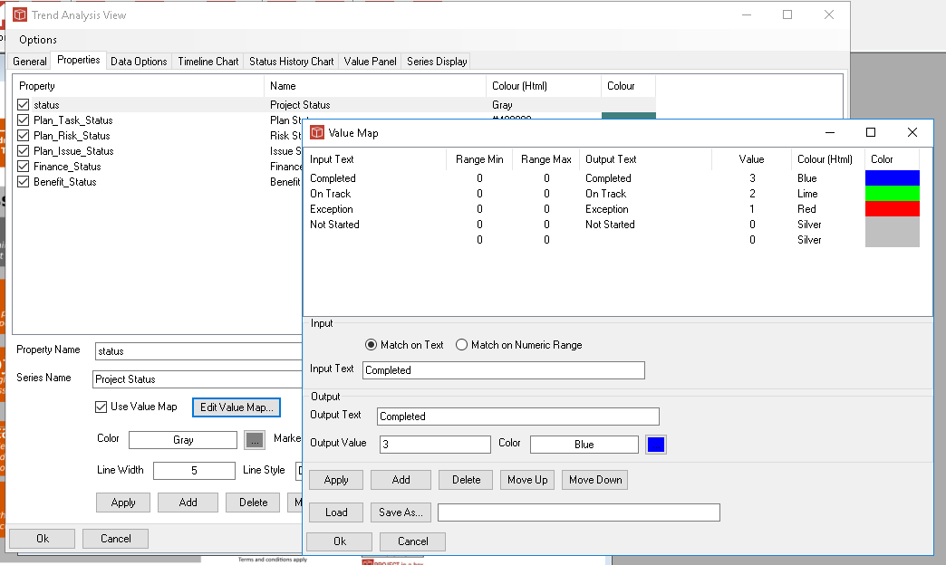
To set the colours to be used in each cell go back to your choice of properties in the Properties tab and access the value map associated with each property as you can see below here. These value maps can be saved and reloaded for consistency across many reports and analysis.
|